Saturday, December 15, 2012

Contact lenses that display text messages

It is getting pretty spooky how quickly science fiction is approaching “science reality.” Researchers at Ghent University in Belgium have been able to produce a spherically curved LCD unit which may find its way into a contact lens. The LCD can handle projected images using wireless connectivity.

The fundamental technology behind this concept already existed to a certain extent, but the researchers at the university’s Center of Microsystems Technology have been able to take it a step further and allow use of the whole surface of the curved lens. “Now that we have established the basic technology, we can start working towards real applications, possibly available in only a few years,” according to Professor Herbert De Smet.  That is an impressive, if ambitious, prediction.  However, at the rate that technology has been advancing, we are not going to contest that objective at all.

Some potential applications would be remarkably simple, such as lenses that would adjust pigmentation and serve as sunglasses. Other applications might involve conveying text messages or navigation instructions. The possibilities do not stop there, this technology may offer additional methods to correct certain vision impairments by controlling light transmission to the retina. Those that like to influence their own mood may be able to adjust coloration and choose to see the world through rose-colored lenses.

Contact lenses that display text messages

For now, the technology is approaching clarity that we might see on a computer monitor. Of course the real trick is to make all that work, provide means of power, wireless connectivity, while assuring comfort and confidence for the user so that he or she is not concerned about putting all that in their eye in the first place. Check out the video below. It is no wonder why they chose to flash the dollar-sign throughout, if they are able to achieve viable commercial applications in “only a few years,” there will be a lot of money counting going on for sure. 

Wednesday, December 5, 2012

ANDROID HISTORY


ஐஓஎஸ்-க்கு போட்டியாக மொபைல் போன்களுக்காக பிரத்தியோகமாக 2003ல் உருவாக்கப்பட்டதே ஆன்ட்ராய்டு இயங்குதளம். முதன்முதலில் Android, Inc என்ற நிறுவனத்தால் தொடங்கப்பட்டு, பின்னர் கூகுள் நிறுவனத்தால் 2005ல் விலைக்கு வாங்கப்பட்டது. பின்னர் ஒஹெச்எ (OHA – Open Handset Alliance) என்ற நிறுவனத்தில் பதிவு செயததன் மூலம் ஓபன்சோர்ஸ் அந்தஸ்து பெற்றது.
ஆன்ட்ராய்டு இயங்குதளம் முழுவதும் சி, சி++ மற்றும் ஜாவா கோடிங்களைக் கொண்டே உருவாக்கப்பட்டுள்ளது.
ஆன்ட்ராய்டு அப்ளிகேசன்கள் சான்ட்பாக்ஸ் எனும் தொழில்நுட்பத்தில் செயல்படுவதால் மிகவும் பாதுகாப்பானது. மற்றும் இந்த வகை அப்ளிகேசன்களில் ப்ரைவசியும் அதிகம்.
கூகுள் தயாரிப்புகளை எளிதில் பயன்படுத்தும் வகையில் உள்ளதால் ஆன்ட்ராய்டு பயன்படுத்தும் மொபைல் போன்கள் ஐபோன்களுக்கு மாற்றாக பலராலும் ஏற்றுக்கொள்ளப்பட்டு மிகவும் பிரபலமடைந்துள்ளது.
முதலில் ஆன்ட்ராய்டு இயங்குதளமானது ஸ்மார்ட்போன்கள் மற்றும் டேப்லெட்களுக்காக மட்டுமே வடிவமைக்கப்பட்டது. ஆனால் அண்மைக் காலங்களில் இது, லேப்டாப்கள், நெட்புக்கள் (Netbooks), ஸ்மார்ட்புக்ஸ் (Smartbooks) மற்றும் ஸ்மார்ட் டிவிகளுக்கும் பயன்படுத்தும் வகையில் உள்ளது.
ஆன்ட்ராய்டு இயங்குதளத்தின் வெர்சன்கள்:

முதலில் ஆன்ட்ராய்டு இயங்குதளம் செப்டம்பர் 2008ல் வெளியிடப்பட்டது.
கப்கேக் (v1.5),
டூனுட் (v1.6),
எக்லைர் (v2.0) 2009ல் வெளியிடப்பட்டது.
ப்ரோயோ (v.2.3),
ஜிங்கர்பிரட் (v2.4) 2010ல் வெளிவந்தது.
ஹனிகாம்ப் (v3.0) 2011 மே மாதத்தில் வெளியிடப்பட்டது.
ஐஸ்கிரீம் சாண்ட்விட்ச் – ஆனது அக்டோபர் 2011ல் வெளிவந்தது.
ஜெல்லிபீன் (V4.1.x) ஜூலை 9, 2012லும்,
ஜெல்லிபீன் (V4.2) நவம்பர் 13, 2012லும் வெளியிடப்பட்டது.

என்னதான் ஆன்ட்ராய்டு இயங்குதளம் உலகப்புகழ் பெற்றதாக இருந்தாலும், அப்ளிகேசன் டெவலாபின்பொழுது டிவைஸ் பிராக்மென்டேசன்(Device Fragmentation) என்ற எரர் பிரச்சனை இருப்பதை யாராலும் மறுக்கமுடியாது.

Friday, November 30, 2012

ANDROID SETUP IN WINDOWS


This one is only for windows,
Ok so this method should work on Win 7 , Vista and outdated XP,,
1st of all u need to download certain files:-
1) Eclipse:- http://www.eclipse.org/downloads/ (many ppl get confused what version to download, get eclipse indigo or juno u will eclips classic 4.2 or 3.7 written out there)
2)U also need to download the android SDK to use defualt android system file, u can download and install the SDK from here- http://developer.android.com/sdk/index.html
3) To get eclipse and SDK workig properly i reccomend u to download the JAVA JDK and JRE, though jdk is more important, jre will/may be needed later on for other uses. U can get the same from here -
Ok so i think thats all u need to download from the browser, rest will be fetched from eclipse itslef.

So now going ahead install all the above 3 and make sure u reboot after all 3 are installed.
Open up eclipse, Click on Help->Install New Software.
click on Add, and enter android as name and https://dl-ssl.google.com/android/eclipse/ as the site to fetch from. now keep following eclispe steps, this will install the Devleoper Tools i.e. the ADT.
yes let this isntall and it will ask you to restart eclipse, do as it prompts.

Now coming to the SDK manager part
Under the windows in toolbar you will see two new android options, click on SDK manger, and it will ask you for the location where u installed ur sdk manager in step 2 of browser download. Do that and then it fill fetch a long list of updates,, dont worry .. you donot need to download all of it. one just needs the tools and API 16,15,10 and 8 for normal use and maximum device support.
so go ahead and fetch that from sdk manager, after thats done, u may need to restart eclipse again.

Now coming to the last step, you need to set up the AVD , which is the android virtual device which allows you to test an app or run an emulator if u dnt have adb device to test on, so to do that click on
Windows->AVD Manager, click on new, select preffered OS and screen size and resolution.. AVDs may run slow on certain low end systems.

Well thats it to set the whole thing up, You can wait for the next uploaded document, where no-coding-knowledge ppl can understand basics and make their own 1st android application easily :D

Thursday, November 29, 2012

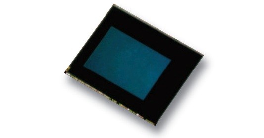
Toshiba introduces 13 MP TK437 sensor with enhanced low light shooting capabilities

Toshiba has just announced that it is launching its new CMOS based sensor which will be part of its next generation range of camera sensors. The 13 megapixel TK437 sensor packs in backside illumination which will help low light performance and improve noise reduction. Toshiba has also integrated color noise reduction (CNR) to develop its newest CMOS image sensor that fits into an 8.5mm x 8.5mm size camera module
Toshiba says that the performance of  the sensor’s 1.12 micro pixels is the same as that of less noisey 1.4 micron units. The test samples for the chip will reach manufacturers in December with sample pricing set at $20 per sensor. On paper, the chip looks like it’ll give good competition to sensors from competitors like Omnivision and Sony. We should expect phones with Toshiba’s Tk437 chip sometime late next year.

Sunday, November 4, 2012

Google brings new security features to Android 4.2 Jelly Bean


Google brings new security features to Android 4.2 Jelly Bean

The new security features are built natively into Android 4.2 Jelly Bean, and the most vital of them, is in essence similar to the Bouncer feature rolled out for the Google Play store in February this year. While the Google Play store is now supposedly cleaner because this feature, Android users are still at risk when sideloading apps from other sources.
Completely opt-in, the ‘verify app’ feature can be toggled from the ‘Security’ section of Android 4.2 settings. Each time users download and sideload an app, it is sandboxed, with virtual walls put up between the app and other software on the device. A pop-up box will then ask user if they want to check the app for potentially ‘harmful behaviour.’ The device will then send information about the device to Google’s servers, and compare it with a database of known applications.
Even if the app is not also listed on the Google Play store, Google is confident it can detect if it is safe or not, as the company says it is constantly scanning the web for newly appearing APKs, and has a good understanding of how the ecosystem works. If the app under scrutiny is detected as safe, the installation will continue, if it is detected as dangerous, it will prevent you installing it. If however, the app is questionably secure, but not strictly harmful, the user will have the option to continue with the installation.
According to Google, the app installation process will not be greatly slowed down by the new security process, as most of the processing happens on the company’s servers, and the user device only has to send an APK signature onward.
As for the other new security features, Google has also introduced an improved app permissions screen, for sideloaded apps, which is apparently much simpler to read than before. Android 4.2 also brings a scanning feature, that detects any attempt by an app to send a text message to a known fee-collecting short code (premium number), and will alert the user. The user will have the option to then allow, or deny the app from continuing with sending.

Google's Android software in 3 out of 4 smartphones


Three out of every four smartphones sold in the third quarter featured Google Inc's Android mobile operating system, as the gap between Google and Apple Inc-based phones widened further, according to a new research report. 

Shipments of Android-based smartphones made bySamsung, HTC and other vendors nearly doubled in the third quarter, reaching 136 million units, according to industry research firm IDC. The strong sales boosted Android's share of the worldwide smartphone market to 75 percent, from 57.5 percent in the year-ago period. 

Apple's share of the market increased to 14.9 percent during the third quarter, from 13.8 percent a year earlier. Apple's iPhone uses the company's iOS mobile software. 

While Android pulled further ahead of Apple's iOS, its gains have come mainly at the expense of rival operating systems Blackberry and Symbian, with shipments of phones running those systems declining significantly. 

IDC analyst Kevin Restivo cited Android's close "tie-ins" to Google's broad array of online services, which include online search and maps, as an important asset that has helped Android grow. 

"Google has a thriving, multi-faceted product portfolio. Many of its competitors, with weaker tie-ins to the mobile OS, do not," Restivo said in the IDC report, which was released on Thursday. 

Google offers its Android operating system free to phone manufacturers, and primarily makes money from online advertising when consumers access its services on the devices. 

Research in Motion's Blackberry operating system had 7.7 percent share in the third quarter, compared with 9.5 percent a year earlier. 

Symbian, which had 14.6 percent share a year ago, had a 4.1 percent share in the third quarter. Smartphone maker Nokia still offers the Symbian software in some of its phones, but the company has largely shifted to Microsoft Corp's software. 

Mobile versions of Microsoft's software accounted for 3.6 percent of the smartphone market in the third quarter. But IDC said that the recent launch of the new Microsoft Phone 8 operating system could improve its position in the fast-growing market.

Thursday, October 25, 2012

ANDROID PICTURE PASSWORD

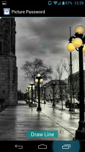
Android has seen different kinds of lockscreen from the first time it hit consumer devices, there is the face unlock, pattern, classic code unlock, etc. Now an XDA developer kevdliu has come out with an application which replicates Windows 8 picture password lockscreen, but also has added many amazing features to it.


Now, this is the next level of security for your mobile devices, until the iPhones finger print scanner is made into use. You can select a custom image as your lockscreen and customize that image by selecting a point and then drawing gestures or lines from that point. Now you have to always press that point and do the customized gesture every time to unlock your device.
This application is really easy to use. You just have to select a background image for your lockscreen and then put in the gestures and customization, the application also allows you to test out your gesture to make sure that you get it right.
The pro version also has options for screen lock delay, start in boot and toast message options.
You can download this application from Google Play store.

Wednesday, October 17, 2012

INDIA FIRST 4G MOBILE PHONE

Bharti Airtel and Huawei have teamed up to unveil what they call India's first LTE TD (4G) smartphone, the Huawei Ascend P1 LTE. The price of the device has not been yet revealed but speculations are it will be around Rs. 30,000.

The Huawei Ascend P1 LTE supports 4G high speed wireless data on the LTE network and voice calls on the 3G network using Circuit Switched Voice Fall Back (CSFB voice) technology. The smartphone runs on Android 4.0 Ice Cream Sandwich OS and is powered by a 1.5GHz dual-core Qualcomm Snapdragon S4 processor.
Other specifications of the device include a 4.3-inch Super AMOLED touch display with a resolution of 960×540 pixels, Corning Gorilla Glass, 1GB of RAM, 4GB built-in storage, microSD card, and an 8MP rear camera with dual-LED flash. The device also supports Wi-Fi, microUSB and Bluetooth connectivity, and ships with a 1,800mAh battery.
"It [4G services] is taking time to ramp up. But it definitely has a wow offer. Right now we are able to offer 40 Mbps of download and 20 MBps of upload speed. The icing on the cake is that the customer pays us around $20 ARPU," says Sanjay Kapoor, Chief Executive Officer, India and South Asia, Bharti Airtel.
Airtel is the first telecom operator in India to launch 4G services. Earlier this year, the telco launched 4G services in Kolkata, later rolled out to Bengaluru as well. Even as 3G coverage gradually expands in India, 4G services, according to an estimate, are estimated to reach 5 million users by 2013. The growth of the TD-LTE market depends on other mobile manufacturers following suit, such as Nokia, Samsung and Apple, which are expected to launch LTE-enabled smartphones in India soon.

Friday, October 12, 2012

iAPPLE IOS 6-FEATURES


Introduction

The next iOS version has never been as big a deal as upgrades to Android or Windows. If it ain't broke, don't fix it, must've been the line of thinking and it's up to you to replace broke with fragmented or catching up, as needed. On the other hand, with the rather rapidly improving hardware, fragmentation is becoming a bit of an issue for Apple to address too.
Anyway, we're now at number 6, along with 5 million (and counting) iPhone 5 users. Now, what follows may seem as a mere prelude to our iPhone 5 review but people only now considering the iPhone 4S may find it quite helpful. By the looks of it, there may be some people considering keeping the iPhone 4S but we're yet to see about that.
Let's focus now on the key additions and improvements to the Apple iOS instead.

Key features

  • Faster and more stable all around
  • Siri available on iPad 3, wider language support with Canadian English, Spanish (Spain/Mexico), Italian, Italian (Switzerland), Korean, Mandarin (Chinese/Taiwan),Cantonese (Hong Kong)
  • Siri now serves sports info, movie and restaurants reviews. It can launch apps and do status updates
  • System-wide Facebook integration: Facebook contacts and events appear in the phonebook and calendar
  • Notification center gets quick Facebook/Twitter update keys
  • New Maps app with TomTom data, turn-by-turn voice navigation and 3D/Flyover view mode
  • Better Safari browser with iCloud tabs, full-screen mode, offline reading and faster performance
  • Passbook e-ticket app handles loyalty coupons, boarding passes, tickets
  • Photo Stream can share photos with other iOS users. Likes and comments are supported
  • Updated Mail app with VIP and Flagged mailboxes
  • Unified FaceTime/iMessages ID. FaceTime works over the cellular network
  • New UI for the App Store, iTunes Store, iBooks Store, Music, Weather apps
  • You can set songs from your music library as alarm tones
  • Improved privacy settings
  • New accessibility options and guided access (single-app mode for kids)
  • Re-organized settings, various new icons
  • Panorama mode in Camera
  • Game Center now supports challenges (achievements)
  • Reject call with SMS
  • Do Not Disturb mode
  • Lost mode
  • Improved keyboards and auto-correction
  • Power toggles moved to top of settings menu (Wi-Fi, Bluetooth, Tethering)
  • Various improvements under the hood

Main disadvantages

  • No offline maps support and maps are not up to scratch currently
  • Variable compatibility across the device range
  • Passbook not on par with Google Wallet, not truly useful
  • An altogether conservative approach to design and layout
  • Notification Center could've offered more functionality
  • No widgets
  • Underused lockscreen
  • Limited themes and personalization options
Apple claims that iOS 6 brings about 200 new features but the noteworthy ones are right there in the bullets above. Depending on where your comfort level is, the major feature can either be the new Maps, the improved Siri or the Facebook integration.
Many people expected to see more from Apple this year but few really had a clear idea what that is. Being "wowed" by Apple has been a legitimate expectation for millions of users out there but those who think their creativity peaked in iOS 4 and the iPhone 4, and has been somewhat flat since, may have a point.
The iOS 6 isn't a dramatic rethink of the design philosophy but brings a reasonable level of change, and improvement, to many important parts of the experience, which will be felt in day to day use.
Follow us as we delve deeper into iOS 6 and find out if Cupertino still has its software chops intact.

Saturday, October 6, 2012

21 Things That Will be Obsolete in 2020


1. DESKS
The 21st century does not fit neatly into rows. Neither should your students. Allow the network-based concepts of flow, collaboration, and dynamism help you rearrange your room for authentic 21st century learning.

2. LANGUAGE LABS
Foreign language acquisition is only a smartphone away. Get rid of those clunky desktops and monitors and do something fun with that room.

3. COMPUTERS
Ok, so this is a trick answer. More precisely this one should read: “Our concept of what a computer is.” Because computing is going mobile and over the next decade we’re going to see the full fury of individualized computing via handhelds come to the fore. Can’t wait.

4. HOMEWORK
The 21st century is a 24/7 environment. And the next decade is going to see the traditional temporal boundaries between home and school disappear. And despite whatever Secretary Duncan might say, we don’t need kids to ‘go to school’ more; we need them to ‘learn’ more. And this will be done 24/7 and on the move (see #3).

5. THE ROLE OF STANDARDIZED TESTS IN COLLEGE ADMISSIONS
The AP Exam is on its last legs. The SAT isn’t far behind. Over the next ten years, we will see Digital Portfolios replace test scores as the #1 factor in college admissions.

6. DIFFERENTIATED INSTRUCTION AS A SIGN OF DISTINGUISHED TEACHER 
The 21st century is customizable. In ten years, the teacher who hasn’t yet figured out how to use tech to personalize learning will be the teacher out of a job. Differentiation won’t make you‘distinguished’; it’ll just be a natural part of your work.

7. FEAR OF WIKIPEDIA
Wikipedia is the greatest democratizing force in the world right now. If you are afraid of letting your students peruse it, it’s time you get over yourself.

8. PAPERBACKS
Books were nice. In ten years’ time, all reading will be via digital means. And yes, I know, you like the ‘feel’ of paper. Well, in ten years’ time you’ll hardly tell the difference as ‘paper’ itself becomes digitized.

9. ATTENDANCE OFFICES
Bio scans. ‘Nuff said.

10. LOCKERS
A coat-check, maybe.

11. I.T. DEPARTMENTS
Ok, so this is another trick answer. More subtly put: IT Departments as we currently know them. Cloud computing and a decade’s worth of increased wifi and satellite access will make some of the traditional roles of IT — software, security, and connectivity — a thing of the past. What will IT professionals do with all their free time? Innovate. Look to tech departments to instigate real change in the function of schools over the next twenty years.

12. CENTRALIZED INSTITUTIONS
School buildings are going to become ‘homebases’ of learning, not the institutions where all learning happens. Buildings will get smaller and greener, student and teacher schedules will change to allow less people on campus at any one time, and more teachers and students will be going out into their communities to engage in experiential learning.

13. ORGANIZATION OF EDUCATIONAL SERVICES BY GRADE 
Education over the next ten years will become more individualized, leaving the bulk of grade-based learning in the past. Students will form peer groups by interest and these interest groups will petition for specialized learning. The structure of K-12 will be fundamentally altered.

14. EDUCATION SCHOOLS THAT FAIL TO INTEGRATE TECHNOLOGY
This is actually one that could occur over the next five years. Education Schools have to realize that if they are to remain relevant, they are going to have to demand that 21st century tech integration be modeled by the very professors who are supposed to be preparing our teachers.

15. PAID/OUTSOURCED PROFESSIONAL DEVELOPMENT
No one knows your school as well as you. With the power of a PLN (professional learing networks) in their back pockets, teachers will rise up to replace peripatetic professional development gurus as the source of schoolwide professional development programs. This is already happening.

16. CURRENT CURRICULAR NORMS
There is no reason why every student needs to take however many credits in the same course of study as every other student. The root of curricular change will be the shift in middle schools to a role as foundational content providers and high schools as places for specialized learning.

17. PARENT-TEACHER CONFERENCE NIGHT
Ongoing parent-teacher relations in virtual reality will make parent-teacher conference nights seem quaint. Over the next ten years, parents and teachers will become closer than ever as a result of virtual communication opportunities. And parents will drive schools to become ever more tech integrated.

18. TYPICAL CAFETERIA FOOD
Nutrition information + handhelds + cost comparison = the end of $3.00 bowls of microwaved mac and cheese. At least, I so hope so.

19. OUTSOURCED GRAPHIC DESIGN AND WEB DESIGN
You need a website/brochure/promo/etc.? Well, for goodness sake just let your kids do it. By the end of the decade — in the best of schools — they will be.

20. HIGH SCHOOL ALGEBRA 1
Within the decade, it will either become the norm to teach this course in middle school or we’ll have finally woken up to the fact that there’s no reason to give algebra weight over statistics and I.T. in high school for non-math majors (and they will have all taken it in middle school anyway).

21. PAPER
In ten years’ time, schools will decrease their paper consumption by no less than 90%. And the printing industry and the copier industry and the paper industry itself will either adjust or perish.

Thursday, October 4, 2012

அமெரிக்காவில் 24 காரட் தங்கத்தை உருவாக்கும் பாக்டீரியா!


அமெரிக்காவின் மிச்சிகன் மாநிலப் பல்கலைக்கழகத்தைச் சேர்ந்த உயிரியல் துறை விஞ்ஞானிகள் நுண்ணுயிரிகள் குறித்த ஆராய்ச்சியில் ஈடுபட்டனர்.
அப்போது, திரவத் தங்கத்தை உருவாக்கக் கூடிய “கியூப்ரியாவிடஸ் மெடல்லிடியூரன்ஸ்’ என்ற பாக்டீரியாவைக் கண்டுபிடித்தனர். இந்த பாக்டீரியாவில் தங்க குளோரைடு என்ற சேர்மம் நிறைந்துள்ளது. இதையடுத்து, தங்க குளோரைடை இந்த பாக்டீரியாவுக்கு உணவாக உட்செலுத்தினர்.
ஒரு வாரம் கழித்துப் பார்த்தபோது தங்க குளோரைடு, திடத் தங்கமாக (தங்கக் கட்டி) மாறியிருந்தது. அது 24 கேரட் தங்கத்தின் தரத்தில் இருந்தது குறிப்பிடத்தக்கது. இவ்வாறு உருவாக்கப்பட்ட தங்கக்கட்டிகளைக் கொண்டு ஒரு கலைப்பொருளையும் விஞ்ஞானிகள் தயாரித்துள்ளனர். அதை ஆஸ்திரியா நாட்டில் நடைபெற்று வரும் கலைப் போட்டியில் கண்காட்சிக்கு வைத்துள்ளனர்.

Nokia might sell their main office in Finland to get some much needed money


Nokia is headquartered in Espoo, Finland, a city that takes less than 15 minutes to get to via bus from the center of Helsinki. The building they occupy is a stunning architectural achievement made out of steel, glass, and ample quantities of wood. According to Reuters, Nokia is so desperate for cash right now that they’re considering selling the building. It’s estimated that the property is worth between 200 million Euros and 300 million Euros. Does this mean Nokia is planning to leave Finland? No. In fact, Nokia probably isn’t even going to leave the building at all. They’ll likely sell it to someone who will then rent it out to them. This sort of arrangement means Nokia can spend less time worrying about real estate, which is a good thing, but it also means that Nokia can decide to leave the building whenever they want.
How should we really interpret this news? The headlines circulating around the internet right now saying Nokia is going to sell the company’s headquarters don’t exactly increase what little confidence people had left in the company. Betting on Windows Phone back in February 2011 is increasingly looking like a mistake. We’re going to have Nokia’s Q3 financial results in roughly two weeks, and the numbers many analysts and industry experts are going to be paying attention to are how much money Nokia has in the bank, how many Lumia devices were sold, how many Symbian devices were sold, and how much money is Nokia receiving from patent royalties.
Will Nokia be around by the end of next year? Probably, but it’s not going to be in the same shape that it was back in the good old days. There’s still so much we don’t know about Windows Phone 8, including this new rumor that says Microsoft is going to enter the smartphone game. If it’s true … what role, if any, will Nokia have in the future?

Sunday, September 30, 2012

APPLE NEW MAPPING SERVICE APPLICATION

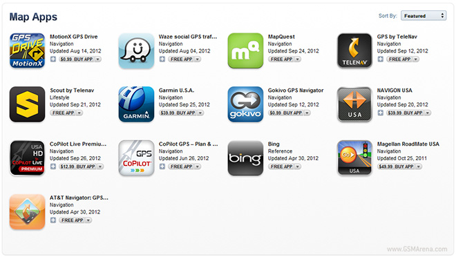
Yesterday, Tim Cook penned a letter to iOS 6 users, apologizing for the sorry state of their new Maps application and promised that they are working hard to make it better. While most would have stopped at that, Cook went on to suggest alternative mapping services that users can use till Apple Maps becomes usable.


Now, Apple has gone one step ahead and created a section in the App Store that can you can find on your iPhone, titled ‘Find Maps for your iPhone’. Clicking on it will show you a bunch of different mapping services, free and paid, that you can download and install on your iOS device.
What’s missing from the list are Google and Nokia’s services, but that’s because they don’t have a dedicated application for iOS. Apple has, however, provided a dedicated page, where you can find out how to access their web services and save it as an icon on your homescreen for quick access.

google map service in india with feature navigation

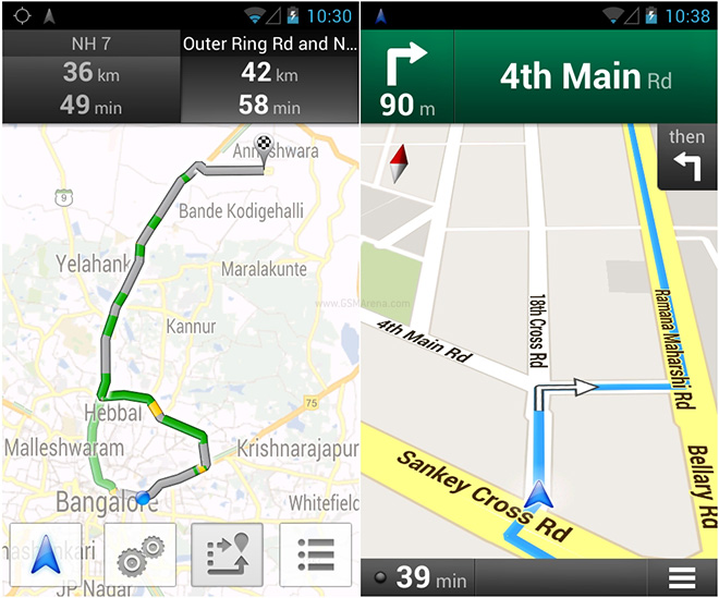
Although the basic Google Maps service has been available in India for years now, some of the fancier features such as Navigation remained unavailable. That is, until now.


Google has now enabled the Navigation feature in India, which means now along with being able to get driving directions you will also have a voice reading them out so you can focus on the road instead of your phone’s display.
Along with voice navigation, Google is also offering live traffic updates for major roads in six large Indian cities and their surrounding suburbs: Bengaluru, Mumbai, New Delhi, Chennai, Pune and Hyderabad. This feature is also available on the desktop version of Google Maps. As usual, it will use colors to indicate the intensity of the traffic so you can avoid the congested roads.
The feature is now live within the existing application (no need for an update) and can be used by anyone with Android 2.2 and above.


Sunday, September 23, 2012

GOOGLE NOW..EASILY CONFIGURE NOW


What is Google Now?

There’s some confusion out there in the Android world. Google Now is not Android’s “Siri killer”, that’s Voice Search (which you can get to and use from within Google Now). Google Now is much, much more than an application that listens to queries and spits out answers. I’m not even sure we can call Google Now a virtual assistant either. Google Now is about automating your life and in return, making your life easier. Google Now does that by providing a vast amount of information, pertinent to you, at your fingertips. There’s just one catch though. Those of your that often go full tin foil hat mode really won’t be able to fully enjoy Google Now to its’ full potential. So take off your head gear and let’s get started.
[Google Now] tells you today’s weather before you start your day, how much traffic to expect before you leave for work, when the next train will arrive as you’re standing on the platform, or your favorite team’s score while they’re playing. And the best part? All of this happens automatically. Cards appear throughout the day at the moment you need them.

How to setup Google Now

To get started, you’ll first need to launch Google Now from either your lock screen by swiping up towards the ‘Google’ icon or by swiping up from any of your soft keys. You can press in and swipe up from the back arrow, home key, and recents key.

If you haven’t launched Google Now until…now… you’ll need to tap through the welcome screen setup


Now go ahead and scroll down the to very bottom and tap the 3 dots (menu button) in the bottom right corner. This will launch the Google Now / Voice Search settings. Tap Google Now to customize your Google Now cards.


You can also view Sample Cards and configure them from the Google Now home screen. Scroll all the way down to the bottom and tap “Show sample cards”.


Most of you will probably need to leave these settings set to default until you get a better feel for Google Now and what information you wish to have at your fingertips, without having to dig through your phone.  Now that you have your cards setup, you need to populate them with some data. You can do that by using Voice Search. You can tap the microphone icon and search for your favorite sports team, weather, restaurant, flight numbers, or anything related to the sample cards provided for you.
For example: “What’s the weather today?” “Do the Yankee’s play today?” “I’m hungry for Chinese food”. You get the idea.
Now you privacy folks you’ll need to remove your tin foil hats for the next part. As I said earlier, to fully get the most of of Google Now, you’ll need to setup a few more tasks revolving around your location.
For your location settings, first head back into the Google Now settings and tap Privacy accounts. By default, all of these settings should be enabled.


Next, tap Manage location settings. This will take you into Maps settings. For best results, you’ll want location history enabled.


Next, so that Google Now can identify your home and work address correctly (instead of your favorite place to hangout) launch Maps. Now select Location history. From here you’ll have the option to configure your home and work locations. (Yes, I work more than 21 hours a week on average. My building at work doesn’t provide the greatest GPS window.)


Now you have Google Now setup and ready to show you some cards. You should start seeing cards immediately for weather, distance to work / home, and possibly other locations. If you’re near a bus station you may see that data populate right away as well. As mentioned earlier, you’ll want to start using Voice Search and searching for other card related items to let Google Now know you’re interested. After you start putting information into Google Now, you’ll start to see cards show up in your notifications. Just tap on them to view them or at anytime you can swipe up from your soft keys or home screen.

Tips and Tricks

Once you close or swipe away a card in Google Now or from your notifications, it isn’t gone, don’t worry. It will come back the next time data for that card changes. For example: if you swipe away your weather, it won’t come back until your location changes or your weather information changes.
You can force cards to reappear by tapping the menu icon at the bottom of Google Now and tapping the refresh button. If you’re still having problems, you can always go into Google Now settings, flip the toggle switch off, reboot, and then re-enable Google Now. You shouldn’t have to do this though.
Add locations to your Calendar events. Google Now will then give you a notification when you need to leave to arrive on time.
If you’ve used Latitude to Check-in to many businesses in your area, you may start to see those show up in Google Now. If you just swipe those away, they’ll keep coming back. When these cards are shown, you have the option to no longer track those places by tapping the settings.
Enabling Web History drastically improves the functionality of Google Now. You can control these settings at www.google.com/dashboard.
Lastly, the more you use Google Now, the better it becomes. Enjoy!


Friday, September 21, 2012

What's New in WINDOWS 8?


The Release Preview of Windows 8 is out today, complete with a new tablet interface and some enhancements to the traditional mouse-and-keyboard desktop. Here's what it looks like.
This is everything Microsoft talked about in their initial announcement of Windows 8, but if you want a more in-depth look at what's new, check out our test drive of the Metro UI, the desktop, Windows Explorer, and the revamped Task Manager, plus our video walkthrough of the Consumer Preview above. Today's release doesn't bring us much that we haven't seen, but if you're curious, you can check out Gizmodo's look at what's new in the Release Preview as well.
Microsoft's "re-imagining" of Windows 8 is focused very heavily on a new, Metro-style touch-based interface. However, they make a big deal of saying that it's just as usable with a mouse and keyboard—and no matter what device you're on, you can switch between the simple Metro interface and the traditional Windows desktop to fit whatever your needs are at that given moment.

Performance Increases

What's New in Windows 8
One of the issues that's been on our minds since they previewed this new interface was whether this will keep bogging Windows down with more running processes, and whether running a full Windows desktop on a low-powered tablet was really a good idea (after all, we've seen Windows run on netbooks).

Microsoft knows your fears, and has addressed them: Windows 8 is slated to have better performance than Windows 7, even with this metro interface running on top of a desktop. We ran a few tests back when the the Developer Preview came out and found that to be the case, especially when it comes to boot times. Tablet users and netbook users especially should notice a fairly significant performance increase with Windows 8. Especially considering that any of your tablet-based apps will suspend themselves when you jump into the traditional desktop, so they don't take up any of your resources.

The Lock Screen

What's New in Windows 8
Windows 8's lock screen is pretty much what you'd expect: it's got a beautiful picture along with a few little widgets full of information, like the time, how many emails you have, and so on. However, after swiping to unlock, Windows 8 shows off some pretty neat touch-based features, particularly a "picture password" feature. Instead of using a PIN or a lock pattern to get into your system, you swipe invisible gestures using a picture to orient yourself (in the example they showed, the password was to tap on a persons nose and swipe left across their arm). Android modders might find this similar to CyanogenMod's lock screen gestures.


The Home Screen

What's New in Windows 8
The home screen is very familiar to anyone who's used Windows Phone. You've got a set of tiles, each of which represents an application, and many of which show information and notifications that correspond to the app. For example, your email tile will tell you how many unread emails you have (and who they're from), your calendar tile will show upcoming events, your music tile will show you what's playing, and so on. You can also create tiles for games, contacts, and even traditional Windows apps that will pull you into the Windows desktop. The tablet-optimized apps are all full screen and "immersive", though, and you can rearrange their icons on the home screen easily (just as you would on any other tablet platform).

Running Apps

What's New in Windows 8
Running a basic app works as you expect—you tap on its home screen icon and it goes full screen. The browser has lots of touch-based controls, like pinch to zoom and copy and paste, and you can access options like search, share, and settings through the Charms bar, which you can get by swiping from the right edge of the screen or pressing Win+C. Apps can share information one another easily, such as selected text or photos. After picking your media from one app, you'll then be able to choose which app you want to share with, and work with it from there. For example, you can share photos to Facebook, send text from a web page in an email, and so on.

None of this is brand new to touch-based platforms, but what is new is the ability to not only multitask, but run these apps side by side. Say you want to watch a video and keep an eye on your news feed at the same time. Just like in Windows 7 for the desktop, you can dock an app to one side of the screen while docking another app at the opposite side, which is a seriously cool feature. Imagine being able to IM and play a game at the same time, or browse the web while writing an email. It's a fantastic way to fix one of the big shortcomings of mobile OSes, thus allowing you to ignore the full desktop interface more often and stay in the touch-friendly, tablet view.

The Windows Store

What's New in Windows 8
The Windows Store, which is now available in the Consumer Preview, looks much like the home screen, with tiles that correspond to different categories and featured apps. From there, you can look at a more detailed list of the available apps in a given section. And, the store contains not only touch-based apps for the tablet interface, but some of the more traditional desktop Windows apps you're used to, so you have one portal to discover all your Windows apps no matter what interface you're using.

Right now, the Windows Store is full of free apps from Microsoft and its partners, so you can check out some of the upcoming apps now. When Windows 8 officially releases to the public, though, you should find many more apps in the store, including paid ones. What's really cool about the app store is that you can try apps before you buy, and then download the full version without losing your place in the app or reinstalling anything.

Sync All Your Data to the Cloud

What's New in Windows 8
The cloud is taking center stage, with your Microsoft account driving all the syncing in Windows 8. Your address book, photos, SkyDrive data, and even data within third-party apps can sync up to the cloud, and you can access them on any Windows 8 device—even a brand new one. Just sign in, and you'll have access to everything (not unlike Chrome OS, which immediately loaded your themes and extensions when you logged in—great for lending your computer to a friend). The address book also syncs with other services like Facebook and Twitter as well. You can even sync all of your settings from one Windows 8 PC to another. Just sign onto your Windows 8 with a Microsoft account and you'll get all your themes, languages, app settings, taskbar, and other preferences will show right up. It's a pretty neat feature if you have multiple Windows 8 PCs and don't want to set them all up separately—just a few taps and you've got all your preferences ready to go.

The Desktop

What's New in Windows 8
The traditional desktop is still there, though it may be a tad different than what you're used to. First and foremost, there's no start button to speak of. Your taskbar merely shows the apps you have pinned, with your system tray on the right, as usual. You can jump back to the start screen (that is, the Metro screen) by pressing the Windows key or by moving your mouse to the bottom left corner of the screen. Other than that, everything looks pretty similar (though the windows no longer have rounded corners). The Control Panel has been updated a bit, as well as the Task Manager and Windows Explorer, which we'll discuss below.

A New Task Manager

What's New in Windows 8
Microsoft's finally redesigned the task manager, and it looks pretty great. You have a very simple task manager for basic task killing, but if you're a more advanced user, you can bring up the detailed task manager filled with information on CPU and RAM usage, Metro app history, and even startup tweaking—so you can get rid of apps that launch on startup without going all the way into msconfig. For more information on the new Task Manager, check out our in-depth look at it.

Windows Explorer

What's New in Windows 8
They didn't show us a super in-depth look at the new Windows Explorer, but we did get a little peek. Most of it isn't new information: we'll have native ISO mounting in Windows Explorer, a new Office-style ribbon, and a one folder up button like the old days of XP (thank God). It also has a really cool "quick access" toolbar in the left-hand corner of the title bar, that gives you super quick access to your favorite buttons from the ribbon. For more info, check out our in-depth look at the new Windows Explorer.

Other Features

What's New in Windows 8
Along with these cool features, Windows 8 also comes with other features we've come to know and love in our mobile OSes. It's got system-wide spellchecking, so you don't have to rely on a specific app to keep your writing top-notch, as well as a system-wide search feature, that lets you search anything from your music library to your contacts to the web itself. It also has a really cool feature for desktop users that lets your run the Metro UI on one monitor while running the traditional desktop on the other.

It also has a really cool feature called "refresh your PC", where you can do a clean install with the tap of a button. Whether you're selling your machine or just want a cleaner, faster installation of Windows, you can do it all in one click. You can even set refresh points, similar to restore points, so you can refresh your PC to the way it was at a certain point in time.